

Auralee and the New Japanese Minimalism: Why Simplicity Became the Brand’s Defining Trait
Japanese fashion has long been associated with designers who question conventional ideas of proportion, construction and beauty, but Auralee represents a quieter chapter of that story. Founded in Tokyo by Ryota Iwai in 2015, the label has built its reputation without relying on conspicuous logos, theatrical garments or a recognisable motif repeated season after season. Its identity comes from subtler decisions: the feel of a fabric, the way a coat falls from the shoulder, the weight of a pair of trousers and shades of colour that often become more interesting the longer they are observed. By 2026, this approach has taken Auralee from a relatively small Japanese label to an internationally recognised name with regular Paris presentations and an expanding global audience. What makes that growth particularly significant is that the clothes have not become louder as the brand has become more visible. Auralee’s version of contemporary minimalism remains rooted in material quality, everyday usefulness and the belief that simple clothing can still contain considerable depth.
How Auralee Created a Different Kind of Japanese Minimalism
Auralee’s story formally began with its Spring/Summer 2015 collection. Iwai, born in Kobe in 1983, had studied at Bunka Fashion College and gained experience in pattern making and clothing design before establishing the label. From the beginning, fabric development occupied an unusually important place in the creative process. Rather than designing an elaborate shape and then looking for a textile capable of producing it, Auralee often works in the opposite direction. Research into cotton, wool, cashmere, silk and other fibres helps determine what a garment can become. This method explains why apparently familiar pieces such as shirts, knitwear, coats and trousers frequently feel distinctive without looking unconventional. The difference becomes clearer when the clothes are handled and worn.
That approach separates Auralee from the idea of minimalism as simply removing decoration. There is certainly restraint in the clothing, but reduction is not the final objective. Iwai uses simplicity to make other qualities more visible. A plain crew-neck jumper places greater emphasis on softness and colour. A wide pair of trousers makes the movement of the fabric important. A conventional overcoat can change character because of its surface, density or unexpectedly light construction. Details tend to support the whole garment rather than compete for attention. As a result, Auralee pieces rarely depend on an obvious visual signature to identify their origin. Recognition comes gradually through proportion, texture and the particular balance between formality and ease.
This has helped establish a version of Japanese minimalism that feels less severe than some earlier interpretations of the term. Auralee does not generally pursue stark geometric purity or treat simplicity as an intellectual exercise. Its clothes are intended to be lived in. Jackets can be generous rather than rigid, shirts can move away from the body and tailoring is often softened enough to work outside formal settings. Even when the construction is highly considered, the finished garment does not demand that the wearer understand its complexity. That distinction is central to the brand’s appeal: considerable work may be hidden inside an item that appears completely natural once it is worn.
Ryota Iwai’s Preference for Everyday Clothes
Iwai’s collections repeatedly return to ordinary wardrobe categories instead of trying to invent entirely new ones. Chinos, denim, knitwear, leather jackets, trench coats, shirts and suits remain part of Auralee’s vocabulary because familiarity gives the designer room to concentrate on smaller changes. A shirt can become interesting through its transparency and movement rather than an unusual cut. Trousers can feel contemporary because their volume has been carefully judged. A traditional jacket can be relaxed without losing its structure. These are modest interventions, but they matter because they alter how familiar clothing feels in daily use.
Everyday observation also plays a significant part in the design process. Iwai has frequently discussed circumstances, people and small changes in daily life as sources of ideas rather than relying on elaborate seasonal concepts. Auralee’s Spring/Summer 2026 menswear collection, for example, took inspiration from the transition between winter and spring and the Japanese idea of Haru Ichiban, the first strong southerly winds associated with the arrival of warmer weather. The clothes reflected that transitional feeling through light leather, cashmere used in unexpectedly warm-weather contexts, relaxed layers and a mixture of brighter colours with soft neutrals. The concept was understandable because it was connected to a physical experience familiar to almost everyone: dressing for weather that changes during the day.
This attention to ordinary behaviour also explains why Auralee rarely looks like fashion designed only for photographs. Pieces are regularly shown as parts of believable wardrobes. A jumper may be draped over the shoulders, a bomber jacket worn with tailored trousers or a shirt combined with relaxed outerwear. The styling does not eliminate sophistication, but it prevents the clothes from becoming remote from real life. That balance is important to the label’s version of minimalism. Simplicity works because the garment already has enough character through material, cut and colour; it does not need complicated styling or constant visual emphasis to justify its presence.
Why Fabric Matters More Than Decoration at Auralee
The clearest way to understand Auralee is to look beyond the silhouettes and consider the materials from which they are made. The company describes textile development as the core of its identity, beginning collections with research into exceptional raw materials and yarns sourced both in Japan and internationally. Those materials are developed in close collaboration with skilled manufacturers and craftspeople, with particular attention given to texture, weight and colour. This process allows Auralee to produce garments whose value is difficult to communicate through a logo or graphic treatment. The textile itself becomes the most recognisable feature.
Auralee’s fabric vocabulary is unusually broad for a label known for understated clothing. Cashmere, wool, silk, organic cotton, leather and denim can all appear within the same season, but they are often treated in ways that challenge assumptions about how a particular material should look or feel. The Autumn/Winter 2026 collection included textured lamb leather, garment-dyed organic cotton heavy moleskin, silk-nep denim, Bluefaced wool, cotton-silk shirting, Shetland wool blended with cashmere and high-gauge cashmere knitwear. These material descriptions may sound specialised, yet the resulting garments remain highly recognisable wardrobe pieces. The complexity is concentrated in making the cloth rather than making the clothing visually complicated.
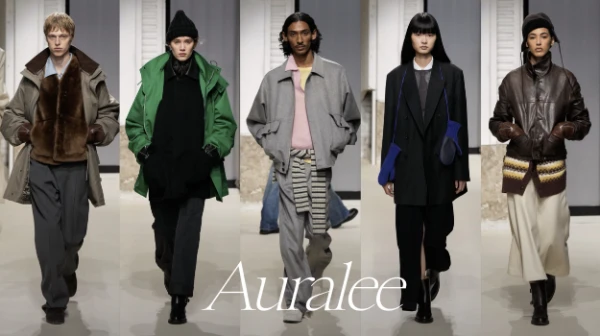
The Autumn/Winter 2026 runway offered an especially clear example of this method. A camel-coloured trench appeared to have the familiar ease of classic outerwear, but its corduroy was made from cashmere. Leather jackets were developed to look unexpectedly thin and light, while silk georgette shirts introduced transparency into a winter collection. Elsewhere, soft wool, suede and cashmere created contrasting surfaces without forcing the silhouettes into exaggerated shapes. The effect demonstrated an important Auralee principle: novelty does not have to come from inventing an unfamiliar garment. It can come from changing what a familiar garment is made from and therefore changing how it moves, feels and functions.
Colour, Texture and Proportion Do the Work of a Logo
Colour has become almost as important as fabric in defining Auralee’s identity. The brand is often associated with sophisticated neutrals, but its collections are considerably more varied than a simple beige-and-grey description suggests. Browns, creams, muted greens and soft greys may sit beside yellow, blue, red, mauve or more saturated seasonal shades. Iwai frequently uses colour in combinations that remain calm even when individual tones are strong. This prevents the clothing from becoming visually flat, one of the common weaknesses of simplistic interpretations of minimalism.
The Spring/Summer 2026 collection illustrated that range particularly well. Vegetable green, vivid yellow, clear red and blue appeared alongside warmer neutral tones, while the silhouettes remained relaxed and controlled. For Autumn/Winter 2026, colour worked together with more substantial textures, including mauve trousers, brown and grey wool, camel outerwear and brighter blue cashmere corduroy. These choices show that restraint does not require the removal of colour. At Auralee, minimalism is more closely connected to how elements are balanced. A strong shade can remain quiet when the cut, styling and surface around it are carefully controlled.
Proportion completes the equation. Auralee frequently uses generous volumes, dropped shoulders, fuller trousers and relaxed tailoring, but the clothing is rarely oversized simply for dramatic effect. Extra volume gives fabrics room to move and can make traditionally formal garments feel more approachable. A wider trouser leg reveals the drape of wool; a roomy shirt makes lightweight cloth more expressive; a softer jacket changes the relationship between tailoring and the body. These decisions give Auralee a recognisable visual rhythm without requiring an emblem to announce the brand. For customers familiar with the label, a certain combination of texture, colour and proportion can be more identifiable than a printed name.
Why Auralee’s Simplicity Has Become More Relevant by 2026
Auralee’s international growth is notable because it has occurred without a major change in the principles that shaped the first collections. The Fashion Prize of Tokyo, awarded to Auralee in 2018, helped create opportunities for greater international exposure and presentations in Paris. The label subsequently developed a much larger overseas retail presence, and Paris became increasingly important to the way its collections were introduced to the international fashion industry. In recent seasons, Auralee’s menswear shows have become regular fixtures in Paris, including the Autumn/Winter 2026 and Spring/Summer 2027 collections presented during 2026.
Greater visibility could easily have encouraged a shift towards more immediately recognisable products, but Auralee has continued to emphasise clothing rather than spectacle. The Autumn/Winter 2026 collection remained centred on fabric, seasonal atmosphere and familiar wardrobe forms, while Spring/Summer 2027 again used everyday emotional experience as its starting point. Presented in Paris in June 2026, the latter collection imagined the anticipation of a summer holiday and moved from relaxed dark tailoring towards lighter, freer clothing. Once again, the idea was communicated through mood, colour and the way garments were worn rather than a complicated visual narrative.
The same philosophy appears in Auralee’s own description of its work. The company emphasises continuity rather than constant seasonal reinvention and describes its goal as creating a wardrobe that can remain relevant beyond the immediate cycle of trends. This does not mean the collections are static. Fabrics change, colours shift and proportions develop from season to season. What remains stable is the belief that newness does not require the rejection of everything that came before. A good shirt can remain a good shirt; the designer’s task is to reconsider its material, balance and relationship with the rest of the wardrobe.
From Quiet Japanese Label to an International Reference Point
By 2026, Auralee occupies an interesting position within contemporary fashion. It is no longer a small name known mainly to Japanese fashion enthusiasts, yet it still operates with the sensibility of a label whose reputation was built through product rather than mass recognition. Its growth has been supported by international retailers, Paris presentations, dedicated stores in Japan and collaborations with companies such as New Balance. At the same time, the main collections continue to focus on categories that were present long before that expansion: knitwear, outerwear, shirts, trousers, denim and understated tailoring.
This continuity helps explain why Auralee is frequently discussed in relation to the wider interest in restrained, logo-light clothing. However, reducing the brand to a fashionable idea of “quiet luxury” misses an important part of its identity. Expensive materials alone do not explain why Auralee looks the way it does. Iwai’s method depends on using textile research, proportion and colour together so that apparently simple clothing rewards closer attention. The absence of obvious branding is therefore a consequence of the design process rather than the entire concept. There is simply less need for an external symbol when fabric and construction already provide the garment with a specific character.
Auralee’s contribution to contemporary Japanese minimalism is ultimately less about removing things than deciding what deserves attention. The brand places material before ornament, proportion before spectacle and continuity before unnecessary reinvention. That approach has allowed Ryota Iwai to develop an identifiable aesthetic while leaving considerable space for the personality of the wearer. More than a decade after the first Spring/Summer collection, Auralee’s clothes still appear deceptively straightforward, but that simplicity is carefully constructed. In 2026, as the label’s international profile continues to grow, its defining strength remains the same: familiar clothes made distinctive through qualities that become clearest not at first glance, but through repeated wear and closer attention.